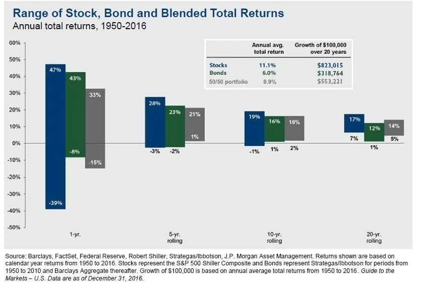
Chart of the Month: Range of Returns
Chart Breakdown:
The Time, Diversification and Volatility of Returns looks at the range of investment performance of rolling time periods from 1950-2016. These rolling returns are broken down in 1, 5, 10 and 20-year time horizons. We are comparing Stocks, Bonds and a 50/50 blended portfolio of both Stocks and Bonds.
What is This Chart Telling Us?
This chart is telling us that volatility and variance can be significant even when we look at the range of a “safe” investment like bonds. There is a 51% range of outcomes in a one-year span for bonds. There is an 82% range for stocks. With that said, as we look at longer time horizons, the variability reduces substantially over time. Even going out just 5 years, the range in outcomes for stocks decreases from 82 down to 31. Variability decreases, but so does risk. Looking at stocks over a 20-year rolling period, the worst they’ve done is 7% per year on average.
The chart also shows the impact of diversifying between stocks and bonds. The blended portfolio shows a much tighter range of performance throughout each period.
Why is this Important?
Most people tend to be too conservative in their retirement accounts (401ks and IRAs). Even if you’re close to retirement, you should realize that retirements can last 20 plus years. As an investor it’s important to know when you will need access to the money your investing.
If you are saving money into a retirement plan or an IRA and you have 30 years before you will need the money, then you should invest more aggressively. If you need the money within a year, it would make more sense to invest conservatively. Two of the biggest mistakes I see with clients is that their investments do not accurately factor in their time horizons and their portfolios do not have the proper mix of stocks and bonds.

